
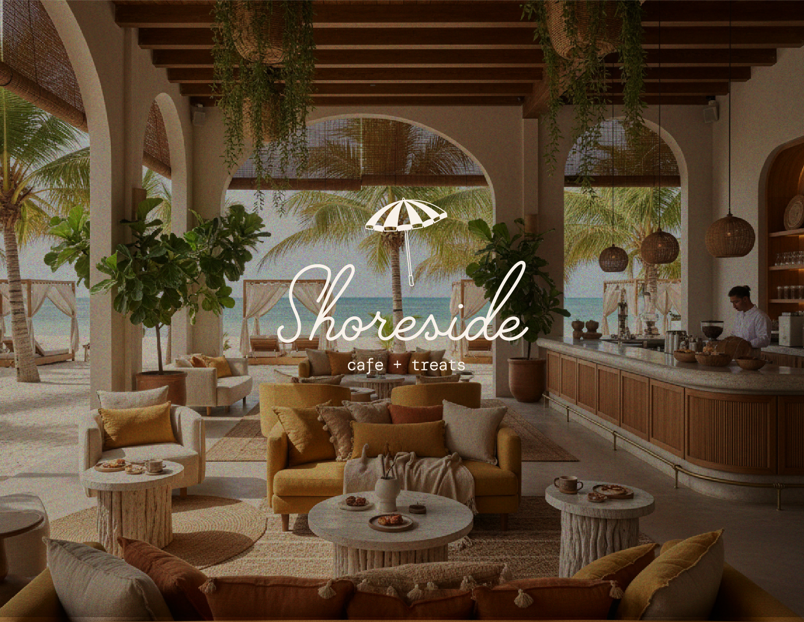
SHORESIDE
A SHORESIDE SNACK DESINATION IN PARADISE
Background
Shoreside was developed as the relaxed, daytime counterpart within the Reverie House hospitality ecosystem. Designed to capture the rhythm of mornings by the water and casual coastal afternoons, the concept needed to feel approachable while still reflecting the elevated standards of the property. It serves as both a guest touchpoint and a community anchor, bridging resort life with local energy.
Challenge
The primary challenge was creating a brand that felt lighter and more accessible than the signature restaurant, while maintaining cohesion with the overarching identity.
Shoreside needed to drive consistent daytime revenue through coffee, light fare, and beach-adjacent offerings without feeling generic or overly themed.
The concept also had to stand on its own visually and strategically, appealing to both hotel guests and locals.
SOLUTION
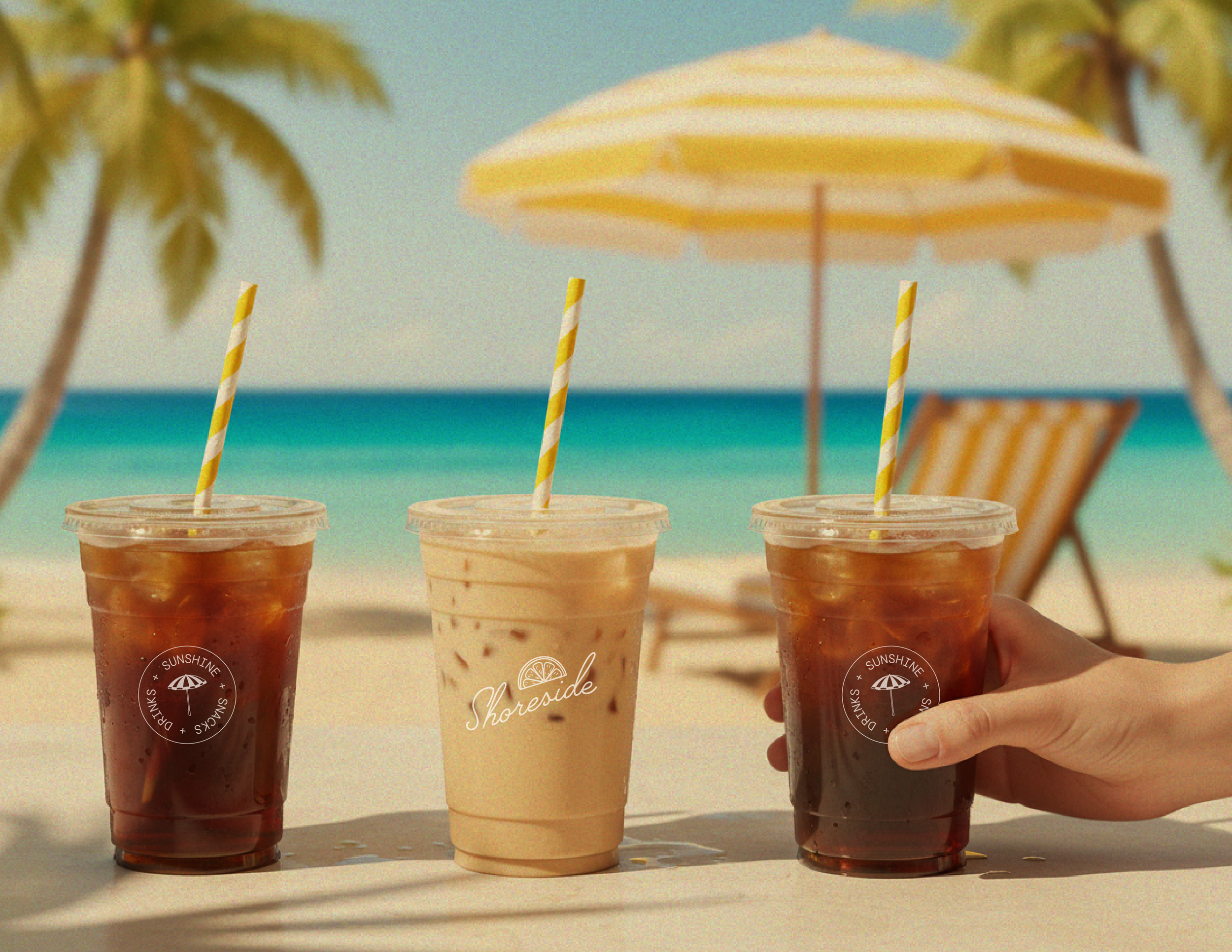
We positioned Shoreside as a refined coastal ritual brand rooted in simplicity, texture, and ease. The identity system emphasizes clean typography, sun-washed tones, and understated graphic elements that echo the shoreline without leaning into cliché. Every touchpoint, from menu design to takeaway packaging to digital presence, was built to create familiarity, encourage repeat visits, and reinforce the larger brand ecosystem while maintaining its own distinct voice.
DELIVERABLES
Brand Identity (Logo, wordmark, illustrations, color palette, font system)
Brand Guidelines
Art Direction
Menu Design
Wayfinding Signage

